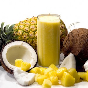
The first two colors for any pina colada palette are white and yellow, naturally. Even alone they have a bright, cheerful quality that can lift you up on a hot summer day. The real challenge is finding a third color to tie everything together.
I considered cherry red as a garnish, or aqua blue, which would bring to mind the slightly different, but no less summery and delicious, blue Hawaiian. Either combination would look great - almost good enough to eat. But I wanted to make the palettes a little more sophisticated and subtle. For the third color, I chose dark brown. It could represent coconut husk, or rum. Either way, it clicks with the white and yellow beautifully.
The first palette is full of sparkle and shine, with beads in three different finishes that capture the light in their own unique way. Hawaiian Sunrise started with strands of crystal AB pinch bicones, which have a milky, swirled look to them. Sunny yellow cat eyes make delicious looking pineapples, and rootbeer lined light topaz AB 6/o seed beads give a warm, syrupy glow.
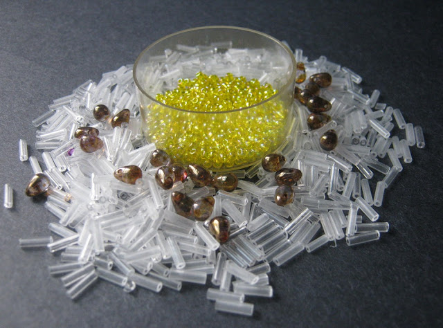
The most challenging thing about putting together three different bead color trios is making sure that they not only look good, but can actually combine for a finished piece of jewelry. So when I picked up some transparent crystal bugles, I had to make sure that they were paired with the right beads. For bumpers and backup, I added transparent lemon AB 11/o seed beads, which have a very juicy quality to them. Dark topaz Czech teardrops round out the palette nicely.
Because of the way the bugles bring to mind shaved coconut topping, I call this palette Summer Cupcake. With just a little thread, these three bead styles would make a wonderful summer broad collar.
Finally, my favorite palette of all is Pass the Limes, which actually looks nothing like the others. I started with topaz yellow pressed glass clamshells. Although they aren’t exactly a pineapple yellow, they have a tropical look to them that I just had to try with the theme. White Ceylon 8/o seed beads look just like coconut milk, and their smoothness is a nice contrast to the matte finish of the shells. I topped them off with transparent rootbeer 11/o seed beads.
This trio is a great example of how a slight variation in hue can change the mood of a palette. Switch the topaz out with another yellow, and it would be pina colada. As it is, all I can see is a tall, frosty glass of beer.
What’s your favorite summer drink? What would you use to turn it into a refreshing bead palette?
Copyright 2011 Inspirational Beading and AllHealthyRecipes.net
Subscribe to Inspirational Beading


:) The yellow clam shells are reminiscent of a "frosty glass of beer." I've been enjoying fresh squeezed watermelon juice. Of course tourmaline comes to mind!
ReplyDeletelovely, i would ever have thought of brown to go with these. I've never worked with yellow, i'm a little scared of it truth be told, thank you for showing me a wonderful way to try it out xx
ReplyDeleteYou're welcome, lynsey! Yellow is one of those tricky colors that always risks making a palette look like a box of crayons. When in doubt, just add neutrals!
ReplyDeleteI love using color combinations from other aspects of life in jewelry making!
ReplyDelete