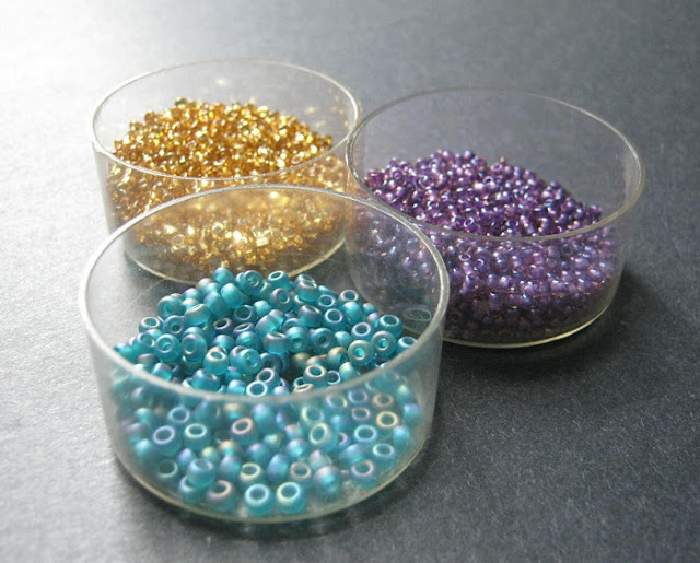
Of course, we also have the option of taking non-traditional colors, and making them seem more festive in the ways that we apply them. Instead of looking at bead palettes in red, white and green, I wanted to examine some of the possibilities of a less obvious color scheme, and make them seem frosty and nostalgic.
Jewel tones and metallics can easily be transformed into stunning holiday designs, so I started with a palette of indigo, seafoam and gold. The challenge will be to pair up the right shades and shapes to create trios with classic Christmas flair.
The brightest and boldest of the triads is Sugar Plum, made with 11/o seed beads in silver-lined topaz, purple lined Rosaline, and 8/o matte transparent teal. There’s a lot of color and shimmer here - it’s a magical palette perfect for ornaments and festive jewelry.
The look of the first palette inspired a second that pays tribute to Vintage Christmas Ornaments, with their unusual shapes and colors. I had strings of Mardi Gras style beads in bright metallic colors and giant flocked glass bulbs in mind when I paired 11/o seed beads in cobalt AB with aqua AB fire polish and antique gold Swarovski pearls.
Finally, the softest palette contains transparent light topaz seed beads, sea foam lined hex cuts, and matte blue raku bugles. This trio brings to mind Window Shopping, perhaps on a street in New York on a crisp December afternoon - elegant jewelry, holiday gowns, and cashmere sweaters.
Do you like to use metallics and jewel tones in your holiday designs? What’s your favorite combination?
Copyright 2011 Inspirational Beading
Subscribe to Inspirational Beading
Get inspired on Facebook


Love this color palette! I do enjoy using all shades of blue for winter designs and jewel tones for holiday designs.
ReplyDeleteoh these are beautiful colors for winter! Definitely outside of the red-white-green box. Thanks for the inspiration =)
ReplyDelete