Wednesday, March 30, 2016
Wardrobe Inspiration: Seaside Picnic
I started with a very beady cluster necklace in pale, smoky blues that are a pretty close match for Serenity. I wanted to maintain a theme with the other jewelry pieces, with round shapes and lots of chunky elements. I was able to find lovely round earrings in both Fiesta and Limpet Shell, plus a great geometric bangle.
Although I really like this palette, I think I would have preferred it with amber and other warm neutrals in place of either shade of blue. The designs themselves definitely work though, and I was able to find a few tutorials to match. These are my favorites:
My Girlish Whims has a great tutorial for a cluster necklace that would work with almost any of your favorite accent beads. The design has lots of potential for layering and patterns, if you want to go with an ombré look as well.
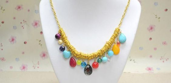
For a slightly less bead-heavy variation, Panda Hall has a great dangle necklace project using a handful of chunkier accent beads. This would make a great stash buster project.
There are a million and one ways to make medallion earrings. This medallion earring project from Jane Chew and Handmade Jewelry Club uses circular brick stitch to create many lovely layers of color.
There are so many great findings for creating your own cabochon settings. This easy photo bracelet project from by Anna H. on Cut Out and Keep can be adapted with any bezel shape and fillings of your choice.
Happy spring, beaders!
Mortira
Subscribe * Facebook * Google+
Send your beading questions to InspirationalBeading@gmail.com
Support Inspirational Beading for bonus tutorials and more!
Copyright 2016 Inspirational Beading
Tweet
Saturday, March 19, 2016
Wardrobe Inspiration: Strawberry Soda
I couldn’t resist going with another multistrand necklace for this collage. The cascade of intense blue beads is totally captivating. Rather than contrast it with chunky accessories like in Spring Crunch, I went with very beady earrings and a wrap bracelet. The cut-out sandals and fringed bag join in with the tiny-scale theme as well.
I love how grown-up and vivacious the pink looks in this trio, while the dark blue just sings. So far this is definitely my favorite color combination of the season. The jewelry designs are also very do-able, and I was able to find lots of great projects to recreate this look.

Two multistrand bracelet projects from Beadaholique could easily be adapted to make a gorgeous cascade necklace. The Ahava Bracelet tutorial includes a lovely palette in Snorkel Blue, while the Square Root Bracelet has the cascade look that works so well in our inspiration necklace.

Mini scale maille earrings are the perfect way to recreate our Iced Coffee dangles, and this tutorial by Karen Karon on Jewelry Making Daily is great for beginners. These would look gorgeous in just about any color.

The Peach Echo teardrop and bugle earrings would be super easy to recreate. For variation, I found a gorgeous tutorial for extra large teardrop earrings with a wirework frame by Rena Klingenberg at Jewelry Making Journal.

There are oodles of tutorials out there for making leather wrap bracelets with crystal cup chain instead of individual beads. I like the Leather Wrapped Cup Chain video by The Potomac Bead Company. To get the same look with another take on the traditional method, try the Sonoran Sunset Bracelet project from Artbeads.com.
What’s your favorite combination for salmon pink?
Mortira
Subscribe * Facebook * Google+
Send your beading questions to InspirationalBeading@gmail.com
Support Inspirational Beading for bonus tutorials and more!
Copyright 2016 Inspirational Beading and Friends
Tweet
Saturday, March 12, 2016
Wardrobe Inspiration: Spring Crunch
I decided to start the first palette with Green Flash, which I think had a lot more potential than just an aquatic-looking palette. I was really wishing for a more orange-y color to work with here, which I think would have made for an awesome tropical themed palette. Instead, I added Buttercup yellow and Lilac Gray for a rather crisp and fresh palette. This trio really brings to mind the first flowers of the season, as well as those first few shoots of wild grass and the subtle sunshine of spring.
The necklace I found is so delicious with loads of chunky yellow beads in a multistrand design. I also included some lovely leaf earrings and a super chunky lavender bangle. It was rather difficult to find garments and accessories that were close in hue to Green Flash. For the casual outfit I ended up subbing Buttercup for a pale crème yellow top. The green frock dress is definitely my favorite of the two, and would make a gorgeous backdrop for our necklace.
Multistrand necklace tutorials are always easy to find – the trick was choosing just a few to share this time! My favorite is a wonderfully chunky multistrand necklace by Restyle Restore Rejoice featuring multicolored stones. This one would be super easy to adapt to any palette that you like. The best feature is the variety of textures and shapes in the strands, which really brings out the beauty of the beads.
To get a look that’s a little more similar to our Buttercup necklace, this turquoise necklace project from Panda Hall is a great way to go. I love the suede cord straps and the easy seed-bead gather. You could also do this project with a spreader bar. I’d love to try it with some wood or tagua hoops to anchor the strands.
I wasn’t able to track down any faceted bangle tutorials, but I did find one amazing polymer clay project that would look gorgeous in our palette. This tutorial is by CW Art and is featured in the Craftster forums. The two-tone design is great for showcasing a favorite palette. I’m particularly fond of the striped embellishment!
For the leaf earrings, I found a wonderful embellished earring project on Fire Mountain Gems that uses leather scraps and an assortment of tiny beads. This design would be so easy to adapt for your tastes and stash. Just picture it in bright green with little aqua dew-drop crystals, or perhaps some lampwork ladybugs!
What’s your favorite color palette for spring or floral inspired projects?
Mortira
Subscribe * Facebook * Google+
Send your beading questions to InspirationalBeading@gmail.com
Support Inspirational Beading for bonus tutorials and more!
Copyright 2016 Inspirational Beading and Friends
Actions you take from this post can result in a commission for Inspirational Beading.
Tweet
Tuesday, March 8, 2016
Bead Color Ideas: Pantone Spring 2016

I know that I was quick to reject Rose Quartz and Serenity partly because I’m so very opposed to gendering colors and toys, and these two colors are a pretty strong reminder of a tired custom. But it wasn’t just the baby-ness of the colors that makes them fall flat for me. Although either shade would look fine in an adult garment or piece of jewelry, they’re not exactly exciting. The pink hue in particular, Rose Quartz, looks sun bleached, especially when held up against most of the other colors in this year’s fashion palette. Serenity has a hint of steely gray with lots of potential, but next to an equally soft pink it’s hard not to see outdated onesies. With these two colors leading the pack, I just wasn't eager to explore the new picks.

When I finally got a chance to really browse through the eight other colors in the Spring 2016 color line-up, of course I found plenty of inspirations. Nothing gets ideas flowing like playing with color. Once I tossed out Rose Quartz there were lots of possibilities for trio palettes to experiment with. I wanted to avoid making obvious choices like combining the very crayon-like Fiesta, Buttercup, Green Flash, and Snorkel Blue, as well as find a way to use Serenity that would bring out its moodier, less baby-blue undertones.

I started with my favorite color in the mix, Snorkel Blue. I’m always keen on shades similar to cobalt, so I wanted to begin where I saw the most potential for inspiration. It took some time to finally decide on a palette for this color. I felt that Fiesta red would be too obvious and Buttercup yellow too easy. I finally matched my blue up with Green Flash, then tried on a few different colors until settling on Limpet Shell, which completes the trio perfectly. For beads I chose transparent cobalt and transparent lime, with some aqua blue Czech teardrops. I love the light in this palette, which would be so great in a lightweight collar or some super long duster earrings.
Spring Lagoon
For the next trio I started with Buttercup. I knew that Fiesta would have to go with it, as it’s much too orange and would look garish next to most of the remaining colors. The final addition was Serenity, which looks much more blue next to these bright hues. Likewise, the softness of the blue seems to have a cooling effect on the red and yellow as well. For the beads, I picked some lustered lemon seed beads and lovely translucent red Java glass rondelles. The closest thing in my stash to Serenity blue was a pair of Picasso coins in a pastel aqua. I’d definitely want to use this trio with bead embroidery with lots of overlapping circles and whorls.

You Can't Take the Sky From Me
The three remaining colors make up a lovely pastel palette with Peach Echo, Lilac Gray, and this year’s neutral, Iced Coffee. I love this trio for spring, especially with the watermelon-esque Peach Echo. This is a hardworking pink that look's like it would be at home just about anywhere. For beads I started with my closest pink match – gel sol rainbow rose seed beads. Lavender-lined 6/o seed beads stand in pretty well for Lilac Gray and are a good match in finish. I finished this trio with some voluta shell heishi which look gorgeous next to these two candy hues. Although I’d love to use this palette in a multistrand piece, I think the voluta spacers would look much better as accents for a cuff or a fringed lariat.

Iced Peaches
Now that I've given the Spring 2016 colors a chance, they're providing all kinds of inspirations. The round up is much better off without Rose Quartz, although I wouldn't mind seeing that one with some chocolate and mint, or perhaps midnight black.
Which Spring 2016 color is your favorite?
Mortira
Subscribe * Facebook * Google+
Send your beading questions to InspirationalBeading@gmail.com
Support Inspirational Beading for bonus tutorials and more!
Copyright 2016 Inspirational Beading
Pantone, Emilio Sosa and TOSIA
Tweet
Saturday, October 11, 2014
Fall Jewelry Colors Part One
This year, the Pantone fall color line up for women’s fashion is definitely unconventional. There isn’t a trace of orange at all, and there is an abundance of red and magenta apparent in colors like Aurora, Sangria, Mauve Mist and color of the year, Radiant Orchid. Even the Royal Blue hides a tiny hint of pink. Compare it to the fall palette for 2010, which includes nearly a full rainbow of colors, and this mix looks a little jarring at first. But is it really so strange?
In a new seasonal collage series this month, I’m taking on the challenge of mixing Pantone picks into trios that look more traditional than the entire palette at a glance. When mixed in the right proportions, any colors can be made to create a certain look or mood, and I hope to do just that - making fall fashions work with all these pinks and purples. Each collage will feature a fabulous statement necklace as always, and a few choice accessories to help inspire great fall designs.
I decided to go with an easy color first, and started my experiment with Misted Yellow, which does look like autumn all on it’s own. After eliminating a few more obvious colors, and ensuring I had enough left over to make two more trios, I finished the palette with Radiant Orchid and Cognac. Then I set out to make purple look at home in October!
Finding the right hues wasn’t an easy task. Misted Yellow was particularly tough to match without accidentally going too pastel or beige. Cognac’s soft and chocolaty look was difficult to uncover under mounds of rich leathers and orangey browns. Finally I had some pieces that I was happy with, including a gorgeous statement necklace with metallic purple chain that almost perfectly matches Radiant Orchid. The hints of yellow sealed the deal. Though it doesn’t match in the least, I still couldn’t resist includin a bright yellow bangle, with a dark amethyst druzy in the center.
To create some of these jewelry styles, check out these tutorials and inspiration projects!
1. DIY Woven Chain Collar Necklace by Honestly WTF
2. Mustard Flower Earrings Project by Beadaholique
3. Bracelet Thread Bracelet Tutorial by Operation Overhaul

4. Sweet Blackberry Collar Necklace Project by Fusion Beads
5. Purple Charisma Necklace Tutorial by Artbeads.com
6. Faux Amethyst Druzy Ring Project by Beadaholique
The purples don't quite match the radiance of this year's leading color, but you get the idea!
And for an extra dose of inspiration, these are my favorite Polyvore sets featuring some of today’s picks:
What do you think of the new Pantone line up? Which colors say ‘fall’ the most?
Copyright 2014 Inspirational Beading and Friends
Pantone and Bibhu Mohapatra
Subscribe to Inspirational Beading
Get inspired on Facebook and Google+
Tweet
Thursday, August 28, 2014
Throwback Thursday: Spring Bead Mix
Thinking about some of my favorite custom bead soups reminded me of a packaged seed bead blend that I was once head over heels for. Way, way back when I first started bead weaving, I had two choices for bead shopping in town. One was a small indie craft store, and the other was a dollar store that stocked such nice things it was more like a boutique. And they carried Czech seed beads, which was incredibly awesome. Both stores sold their beads in tubes, and one SKU in particular was always in stock - much to my delight.

The mix was called Earth, and included copper lined: transparent dark gray, crystal, Montana blue, mauve; and a gorgeous, stunning, copper lined green. If it weren’t for the metal lining, I would still be using that color today, because it is amazing. The mix that I liked also included color-lined crystal seed beads in Montana blue, pale blue, pink, and sometimes mauve. I’m a big fan of the color-lined crystal finish, and on occasion I used just the color-lined beads and left the rest of the mix for other projects. At some point, the recipe changed, and the color-lined beads were replaced with copper-lined blue and pink.
I lost access to this mix when both of the stores I shopped closed, and then I gave up using metal-lined seed beads. Even when I went back to ordering Czech seed beads online, I never thought to look this mix up and see if it was still available. It turns out you can still get the earth mix, but it doesn’t quite have that pop that I loved way back when.
Do you have a favorite bead mix or blend?
Copyright 2014 Inspirational Beading
Subscribe to Inspirational Beading
Get inspired on Facebook and Google+
Tweet
Monday, November 4, 2013
Book Spotlight: Polymer Clay Color Inspirations
Lindly Haunani and Maggie Maggio have created a primer for working with polymer clay - the type of book that you should read through twice before buying your first brick of clay. Not only is it an incredibly valuable resource for the basics of color theory, but each chapter includes homework assignments designed to help readers absorb and understand the concepts. By making these polymer clay inspiration tools and practice projects, beginners can become familiar with color mixing, conditioning, and baking before starting on their first official design.
The entire book is filled with gorgeous full color photographs of finished jewelry and sculpture that provide examples of the color ideas being discussed. The projects include helpful step photographs and tips to get the best results. Topics include: Polymer Clay Basics, Understanding the Properties of Color, Choosing Colors for a Project, Mixing Colors That Flow, Orchestrating Color Combinations, and Exploring Color Composition, just to name a few.
Although many of the assignments include mixing and baking clay samples, the entire book is a useful color course for all artists and designers. The first project - making an inspiration collage - is an incredibly enlightening exercise in finding one’s go-to palette, and making it work in designs. At the back of the book, artists can find charts and scales to use when making color choices, and a handy resource guide.
If you’re ever feeling like you’re in a color rut, or want to try out a totally new medium with bold color possibilities, Polymer Clay Color Inspirations
Copyright 2013 Inspirational Beading
Potter Craft/Crown Publishing, Lindly Haunani and Maggie Maggio
Subscribe to Inspirational Beading
Get inspired on Facebook and Google+
Actions you take from this page can result in a commission for Inspirational Beading.
Tweet
Saturday, March 2, 2013
Inspired Designer: Boo and Boo Factory

Inspirational Beading: When did you first get started with jewelry design?
Christina: I am formally trained in architecture but found myself drawn to smaller scale design. I love designing jewelry because it is one on one and I create the piece from beginning to end with a tangible object to hold in my hand. I love fashion, so it was only right for me to experiment with jewelry.
Inspirational Beading: Have you always been drawn to working with leather?
Christina: I had an old leather skirt and one day deconstructed it and began cutting it. I love the way leather holds it's shape and that it is malleable. From there, my jewelry designs progressed and now I have Boo and Boo Factory.
Inspirational Beading: Where do you look for inspiration?
Christina: I am really inspired by architecture, of course. But I love science and biology, which you can see in the patterns in my pieces. I look at a lot of art, fashion and design blogs. Everyday I try and find new works that inspire me to create.
Inspirational Beading: What’s the most interesting or unique thing about your design process?
Christina: I never sketch! I create everything on a whim. When I sit down to create something, I just start cutting, organizing colors and playing with various compositions until it feels right. I never know how a piece will turn out until it is finished.

Inspirational Beading: Do you have a favorite color to work with?
Christina: I really do not have a specific color that is my favorite. I have collected so many colors throughout the years that I cannot decide! I do love neon, in case you didn't notice from browsing my shop. I love to work with various shades and families of color. I love experimenting with color and coming up with new color combinations that I would not usually be drawn to but that I feel are fun because they are unexpected.
Inspirational Beading: What are some of your other favorite materials?
Christina: Leather, of course. I love finding new beads, bronze charms and different materials such as silicone tubing or rubber.

Inspirational Beading: What is the most exciting design in your shop right now? What makes it special?
Christina: Neon Statement Necklace Geometric Emerald Leather Color Block Triangles is my most exciting because it is a design I created when I finished graduate school. You can see the progression of the designs and how much more intricate they are becoming compared to when I first opened the shop.
Inspirational Beading: Who do you hope to inspire with your work?
Christina: I literally started Boo and Boo three years ago with some scraps of leather and 10 dollars. Today, it is my full time job and I pay rent, bills and have money left over. I hope to inspire someone to take a leap and follow their dreams. You do not have to work a corporate job for somebody else when you can be your own boss.

You can see more vivacious leather jewelry at Christina‘s Etsy shop, or check out the Boo + Boo Factory blog and Tumblr. For new design updates and more, follow along of Facebook and Twitter.
Copyright 2013 Inspirational Beading and Boo + Boo Factory
Images Hosted by Pinterest
Subscribe to Inspirational Beading
Get inspired on Facebook and Google+
Tweet
Wednesday, January 30, 2013
Red and Pink Jewelry Designs
Red and Pink Bead Embroidery by Dreams of Charlotte
With color blocking continuing to be a popular trend for garments, pairing bold colors together is almost always a Yes. But what about jewelry? Thanks to the wide variety of finishes and shapes available for beaders, there are a lot of great ways to pair pink and red for romantic and cute spring jewelry. Lipstick red and hot pink are a favorite, but there's also room for scarlet, baby pink, and the orangey shades of coral.
I recently went on a hunt for fabulous pink and red designs. Some of my favorite pieces are those that made use of a third color - something to both anchor and separate the two colors and create a pleasing trio. Some combinations work better than others, and as with all bead palettes, the finish is just as important as the color.
Spring Earrings by Little Apples
Necktie Bracelet by Pistil and Pennyroyal
Fused Glass Heart Pendant by Silver River Jewelry
Valentine Necklace by Sweety Stuff
Red Sorbet Bracelet by Town of Beadrock
Valentine Button Charm Bracelet by randomcreative
Retro Fabric Button Earrings by Hollywood Hillbilly
Double Strand Stone Necklace by Red Chair
Wooden Triangle Necklace by Theia Design
Cherry Blossom Earrings by Verveine Designs
Neon Minimalist Necklace by NES Wedding Garden
How do you feel about this newly approved color combo? Are you using it in your spring designs?
Copyright 2013 Inspirational Beading and Friends
Images Hosted by Pinterest
Subscribe to Inspirational Beading
Get inspired on Facebook and Google+
Tweet
Inspiration Topics
Learn About Sponsoring Inspirational Beading with Project Wonderful
Affiliated With ShareASale.com and Amazon.com