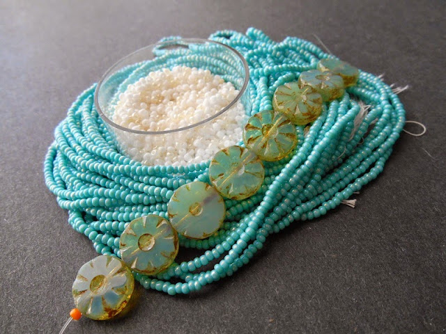
Subtle bead colors can often be the most difficult to find palettes for, as they can look washed out and forgotten next to more exciting colors. The trick is to find contrasts and complements that enhance the existing colors to make them stand out, blend in, or shine in just the right way.
I recently added some pretty Czech glass coins to my stash of accent beads. The translucent, pale sea foam shade is delicate and airy, requiring just the right colors to make the coins ideal focals in beadwork. The Picasso finish helps a little allowing for a little more play with a two-tone finish.
First I started with seed beads in the same colors as the coins, but with very different shades. Transparent dark amethyst plays up the Picasso finish, making it much more obvious and adding to its beauty. Meanwhile, cobalt complements the pale blue, and washes out some of the green tinge. Although the blue is so much stronger than in the coins, the colors work well together with the rich brown backing them up. Surf would look great in a multi-strand piece, or a design where the coins stand out dramatically from the beadwork.
Next I wanted to experiment with more organic colors, to highlight the greens in the finish. I started with dark pearl cream, bringing to mind harvest vegetables or fields of grain. Next I tried out some opaque apple green, but it looked much too busy next to the sophisticated Picasso finish and the shimmer of the pearl seed beads. Instead I found that transparent rainbow lime adds a lot of personality, without being too bold. Sprout would be really fun with light stitches such as daisy chain, or designs with lots of fringe.
Finally, I wanted to include a neutral. Starting with some turquoise iris, I considered both black and white seed beads to complete the palette, and found white to be a better match for the delicate nature of the coins. Rather than go with a stark opaque, I used a custom mixture that includes opalescent cream and white AB. Not only does the mixture look great with the shimmer of the turquoise beads, but it has a playful look that provides a nice backdrop for the pale Picasso. Splash could work in both cool summer designs, and frosty winter ones.
Do you like to use soft bead colors in your work? What’s your favorite?
Copyright 2014 Inspirational Beading
Subscribe to Inspirational Beading
Get inspired on Facebook and Google+
Monday, July 14, 2014
Subscribe to:
Post Comments (Atom)
Inspiration Topics
accessories
amulet
Ancient Worlds Modern Beads
animals
April's Army
art
ArtFire
astrology
astronomy
autumn
awards
awareness
bangle
beach
Bead Inspired
Bead Shops
bead soup
bead spotlight
bead stash
Bead Trays
beaded beads
beading theory
beads
belt
bezel
birthstones
black
blog spotlight
blue
boho
bone
book spotlight
bracelet
Bracelet A Week
branch fringe
brick stitch
brown
bugles
buttons
cabochon
ceramic
chain maille
challenge
charity
chevron chain
christmas
collar
Collections
color
Color Ideas
color triads
conservation
craft shows
crafts
crochet
crystals
cuff
Culled Beads
current events
Current Faves
daggers
Daily Sets
daisy chain
Delicas
Destash
drops
Dutch spiral
earrings
Egypt
Egyptian Gods
embellishing
embroidery
environment
etsy
exotic
fair trade
fantasy
fashion
Favorite Beads
Favorite Techniques
feminine
fibers
film
findings
fire polish
fixtures
Flashback Test
flickr inspiration
flowers
food
found object
free form
fringe
Geek Jewels
geekery
gemstones
geography
giveaway
glass
gold
gray
Greece
green
herringbone
hex cuts
history
holiday
home decor
insects
inspiration tip
inspired beader
Inspired by...
Inspiring Links
ivory
Jewelry Stash
knitting
ladder stitch
lampwork
lariat
leaf fringe
leather
lights
literature
loomwork
macrame
magatamas
Master Class
Medallions
metal free
metalwork
Mini Collar a Week
mixed media
mixture
Mood Board
MOP
multi-color
multi-strand
music
natural beads
nature
necklace
Necklace a Day
Nepal chain
netting
New Beads
ocean
ombre
orange
paint
paper
patterns
pearls
pendant
peyote
photography
Picasso finish
pink
Pinspiration
PMC
polymer clay
poster sketch
purple
quick inspiration
rainbow
RAW
red
resin
ring
Ring a Day
rivoli
Rome
Russian spiral
scarf
science
seed beads
shell
silver
soutache
spiral rope
spring
square stitch
St. Petersburg
steampunk
stringing
stripes
summer
tagua
TBT
The Elements
thread
Tilas
Time Capsule
tools
trade beads
triangle weave
tribal
tropical
turquoise
tutorial
two-hole beads
Ugly
vintage
Wear it Twice
weather
white
winter
WIP
wire
wishlist
wood
World Beaders
yellow
Blog Home * About * Beading Tutorials * Advertise
Learn About Sponsoring Inspirational Beading with Project Wonderful
Affiliated With ShareASale.com and Amazon.com
Learn About Sponsoring Inspirational Beading with Project Wonderful
Affiliated With ShareASale.com and Amazon.com
I prefer the bead color ideas for dragonflies the best. The blue and orange are rather bold while the turquoise and white just, well, crystal ab might look better with that one or a pearl. The green and cream or orange look very good. Makes me think of flowers. I really like the focal beads.
ReplyDeleteI agree with the previous post. That palette stood out for me.
ReplyDeleteThe green is my favorite as well - very fresh and vibrant!
ReplyDelete