Have you ever walked through a department store at the beginning of a season, and noticed that the same color trends appear in many different sections? One summer, everything from patioware to handbags came in a selection of tangerine, chartreuse and cobalt.
It might seem strange that all these different companies and designers would somehow select the same color schemes at the exact same time, but there’s a secret behind it. Every year, experts in the realm of color come together and decide on the season’s top color choices for the Pantone color report.
The idea that everyone should sleep on, eat from and wear the same colors, then switch them up again in four months is really the opposite of what the
handmade movement is all about. Still, when Artbeads.com sent out a challenge to create a new design using
Pantone’s 2010 fall palette, how could I resist?
The Inspiration:
This year’s fall color lineup includes some great classics like Living Coral, Lipstick Red, and Endive. Many of the color selections are wonderfully bright and vibrant, perfect for adding some personality to fall essentials in neutral colors.
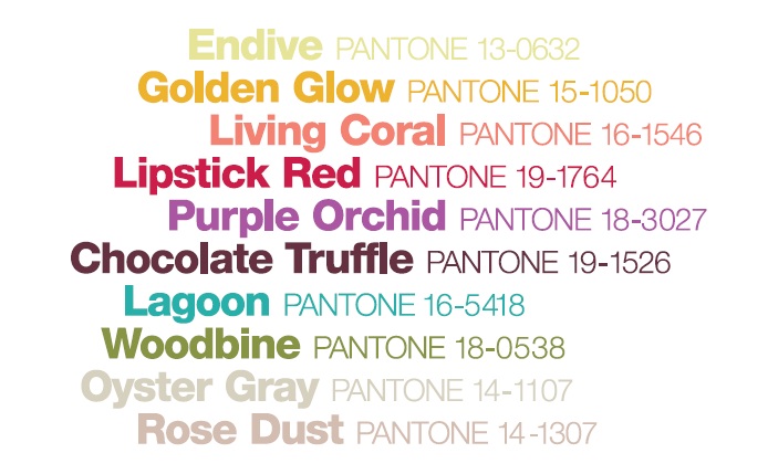
Although it was tempting to mix up fun shades like Purple Orchid and Lagoon, I wanted to test myself and decided to combine all of the earthy tones and see if I could do them justice. With a palette of Endive, Golden Glow, Chocolate Truffle and Rose Dust in mind, I went hunting for some perfect fall beads.

The Beads:
The very first thing that caught my attention was a gorgeous Colorado topaz fancy oval by
CRYSTALLIZED™ - Swarovski Elements. The color is fantastic, and full of warm, glowing sparkle. I picked up a big, bold 39x28mm version and moved on to the accents.
I was really exited to come across some limited edition Czech glass druks in fun finishes, and chose tortoise for Golden Glow and brown horn for Chocolate Truffle. The 11/o lustered dark beige beads look so much like coffee caramels that they had me craving candy for days. I topped it all off with some 15/o
seed beads in frosted topaz and terracotta.
The Beadwork:
I was so smitten with the
druk beads that I wanted to do something with lots of beady texture, but once I had all the pieces in front of me, the colors started to take on a personality of their own. In my mind’s eye, I kept seeing circles, so I started out with
circular brick stitch, using the druks for a base. After stitching one round disk, I could see that something wasn’t quite right, so I switched to one of my favorite techniques - circular peyote.
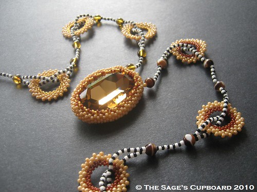
Great Spirit Necklace
I made a few peyote rings using each shade of 15/o’s at the center, and added a matching peyote bezel to the fancy oval. Once I had all the components ready to assemble, decided to place the different colored rings and druks on opposite sides, rather than use a symmetrical pattern. The overall effect of the colors and shapes was very tribal - like ceremonial leather.
I still felt that the design needed
something else. Instead of stringing everything together using the caramel 11/o’s, I used black and white seed beads, adding an extra layer of tribal appeal, which also allowed the opposing colors to stand out more clearly. This necklace is definitely ready for fall.
What are
your favorite colors from Pantone’s fall 2010 lineup?
Copyright 2010
Inspirational Beading,
Pantone Inc. and
Elie Tahari
I would like to thank Artbeads.com for providing the beads and crystals used in this piece. Inspirational Beading has not received paid compensation for including Artbeads.com products or reviews in this blog post. I have shared my honest opinions about the products used in this design.