

For years, I’ve been using simple dark gray cardstock for my photo backgrounds. I like it because it’s inexpensive, convenient, requires virtually zero storage space, and most importantly, provides the truest color. Once I found the right combination of light and camera angles, I was able to get photographs that required no editing to look ‘right’, and that looked similar every time, providing a cohesive appearance to my storefronts.
I have tried using different backgrounds from time to time. White cardstock creates too many shadows, and makes colors look dull. I once experimented with natural-looking shelf paper, but it proved to be too shiny under natural light. I went running back to my reliable gray card, with the hope that someday something better would come along.
Last week I decided that it was time to try again. I want to give my first photos and thumbnails a more Egyptian - and ultimately more treasury-worthy - look, by adding a lighter background. And what better backdrop could there be for Egyptian inspired jewelry than papyrus? Perhaps you’ve seen kids craft projects that create artificial papyrus scrolls using strips of brown paper lunch sack. I decided to use this simple technique to make my own papyrus backdrop, though hopefully with a more authentic look.
First, I picked up some newsprint style sketch paper - I hoped that the pulpy look would give a more natural appearance to the finished scroll. I soaked sheets of paper in coffee to give them a more organic color, and set them out to dry. The color wasn’t quite right, so when it came time to decoupage the strips together, I used a mixture of glue, water, and a hint of yellow acrylic paint. At first I wasn’t pleased with the results, but after letting the layers of paper dry overnight, I was happy to find that the color was very similar to the real thing. All that’s missing is the gauzy, grainy look of real papyrus strips.
The true test would be whether or not the fake papyrus would provide a good background for jewelry photos. Just in case it didn’t turn out, I also picked up some additional backdrops - a packet of desert-themed scrapbook papers. While I was at it, I also tried out some new lighting angles. Here are the results:


Handmade Papyrus


Old Manila


White Sand


Red Dunes

Paper Pulp


White


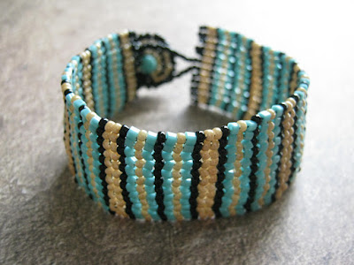
Traditional Gray
I like how most of the pictures turned out, but I can’t quite decide if I should make a switch. Which background do you like best?
Copyright 2012 Inspirational Beading
Subscribe to Inspirational Beading
Get inspired on Facebook and Google+


The pattern on the Red Dunes is too distracting, to my eye. I think I like the trad gray best, but the papyrus is a really, really close second.
ReplyDeleteI liked seeing these samples; they'll help me figure out what I'm doing with photos. I've been using the skirt of a gray wool dress lately... a little too dark and much too fuzzy for really good pictures!
Personally I like the Red Dunes
ReplyDeletePaper pulp and manila are the two I favor because they complement this particular bracelet. I get why you want some consistency between shots and a simpler photo shoot as well, but I'm not convinced it's the best way to show off your work. People are attracted to hand crafted items because they are not all the same. Take advantage of your creativity and have some fun with your photos. Customers will see that shining through!
ReplyDeleteI say stay with the gray, it works and looks great with the colorful jewelry you make. The white is too stark, the ones with print or specks in them just distract from the beauty of your piece. I think you have the formula down so no need to mess with it!!
ReplyDeleteAs I was scrolling down, the paper pulp caught my eye because of the subtle texture and the brighter look to the colors. But then, boom!, your traditional gray really popped out at me. Look how bright the colors are! For this particular bracelet, I have to go with your tried and true! Know what you're going through, though. Am re-taking a lot of mine with a white background and then using FotoFuze. The sun is so harsh here that I was having a hard time with the color I have been using for years. The paper also has gotten so old and tatty looking and, of course, it's no longer made. Am not 100% sold on the white but the colors are more true and really seem to pop off the page. I get lots of compliments now. Thank heavens for FotoFuze!
ReplyDeleteI like the traditional gray and the paper pulp, which is always pretty gray. I switched to a gray background this past year and love it. It works much better for me than white.
ReplyDeleteI really like the white sand. More texture than just plain white but still classic. Red dunes is my least favourite, too dark & too distracting
ReplyDeletePersonally, I like the red dunes best for this bracelet. That being said, I don't think one background will work for all samples. If you make a really light colored piece of jewelry, you don't want to photograph it on a light background, because it won't stand out. So, I think (just my opinion, obviously) you need different backgrounds for different projects. To get the best image possible.
ReplyDeleteA background should be just that, in the background. Your attention should go immediately to the object of the photograph, the background should show that off and not really be noticed. (again, just my opinion) ^_^
Love this site! I'm so glad I stumbled across it.
Thank you so much for your feedback! I think I'm going to stick to gray for awhile, but keep experimenting with the other backgrounds until something really clicks.
ReplyDeleteI love Red Dunes in these photos, but have some reservations about how it would look as a single backdrop with a wide variety of projects.
ReplyDeleteAs for making your own papyrus, I had a school project that required "old" looking paper, and it might as well have been papyrus. Yes it was way back in fifth grade but still I recall a sequence of things we did to get it just right. ("We" meaning me and my dad, um mostly my dad -- speaking of which, why do they assign such things?? The first time I was asked to make a diorama my mother had to call the school to find out what that meant LOL ) Anyhow, if you'd like some tips, give me a shout.
I really like the traditional grey and do you have a tutorial for this bracelet for sale? I love it the big cuff look. Great blog-just found you and love it. Very creative. Thanks, Stephanie
ReplyDelete